PWHL Rebrand
The PWHL is a recent addition to the professional hockey world but the teams originally lacked personalized branding and unique identities. This project aimed to rebrand each of the six teams accurately based on their regional locations and their players. After the rebrand that includes new logo variations, typography, and color applications laid out in brand guidelines, each identity is applied to merchandise and a social media campaign to help exposure to the public.
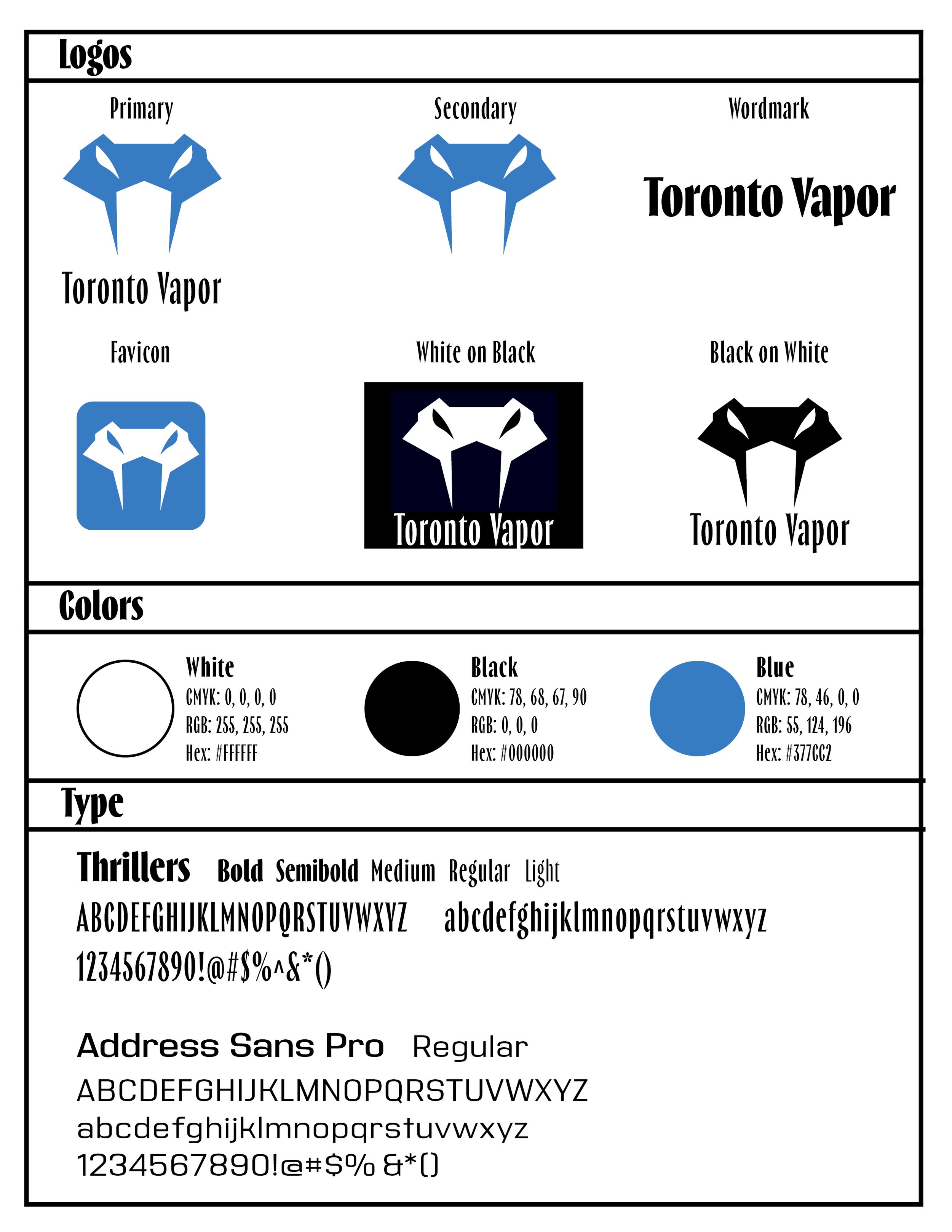
Toronto Vapor
The city of Toronto used to be known as “The Big Smoke” so to capture that nickname/history but in a more intense way, I chose the name “Vapor.” The logo is a play on the word, portraying the viper snake.


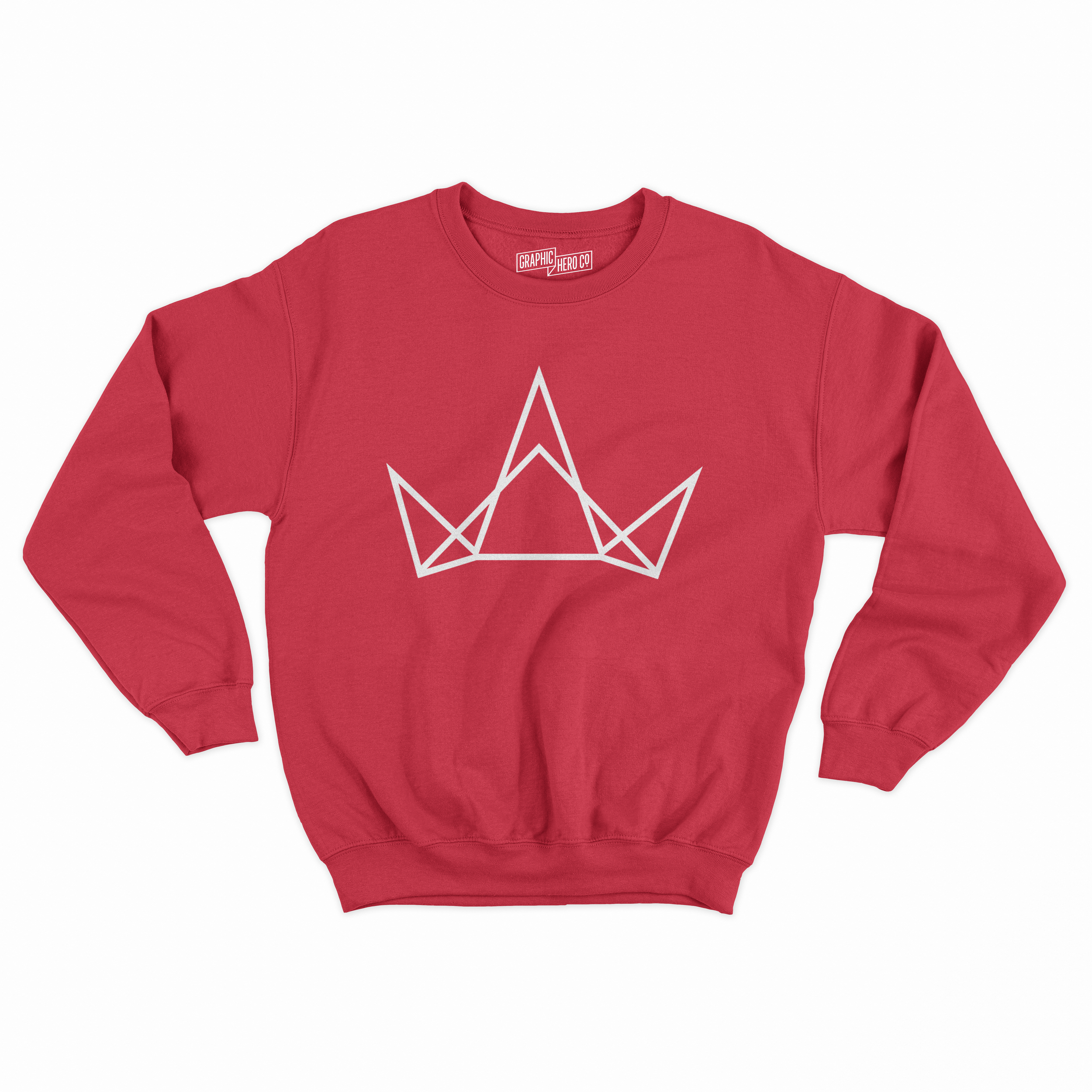
Ottawa Reign
Being in Canada, Ottawa has a monarchy so I wanted to portray that aspect of their story in the logo and name. With the logo being a sharp crown to capture intensity and aggression.


Montreal Royals
Also, like Ottawa, Montreal is under the monarchy and I wanted to reference their French roots with the combination of symbols for both in the lion logo.


Boston Mystics
Boston has a river that runs through it called the Mystic River. The name Mystics implies a mysterious and ominous energy that fits the team. The eye logo is meant to be like an omniscient eye that has a magick sparkle icon in the center.


New York Mayhem
New York is a large, chaotic city with many different cultures and people mixing together so I chose the name Mayhem with the tornado logo for their team.


Minnesota Frost
Set apart from the rest of the teams, I wanted to reference the cold climate of Minnesota in the name Frost and call back to the Minnesota Wild logo of their NHL team with the bear logo.


